This morning I visited the Art Deco, 1925 exhibition at the Calouste Gulbenkian Museum in Lisbon. This world-class, exquisite show would surely please Calouste Gulbenkian, the Armenian-born billionaire to which Portuguese science and culture (and myself, as a FCG/FLAD grant holder) owe so much. His famous motto, “only the best”, made the museum and foundation that bear his name two of the world’s most respected and sophisticated institutions.
Curated by Chantal Bizot and Dany Sautot and masterfully designed by Mariano Piçarra and Ricardo Viegas (graphics), the exhibition is a true arts décoratifs treasure trove. From carpets to glass, jewellery to books, it presents a wide range of (mostly applied) artworks that mirrored the prevailing message of 1925’s International Exhibition of Modern Decorative and Industrial Arts: the triumph of the ensemble as an expression of industrial and artistic progress.

There were however dissonant voices at this exhibition of luxury and excess by the Seine. In the pavilion Le Corbusier designed for L’Esprit Nouveau, the magazine founded in 1919 with Amédée Ozenfant and Paul Dermée, he rejected the notions of ensemble, luxury, even craftsmanship, in order to design an industrially-made building and furniture (even if this ended up being easier said than done, as the only really industrially made object in the pavilion were the Thonet chairs). In this pavilion, art would not be subservient to decoration, but would regain its independence from it. The controversy and rupture created by Le Corbusier at what became known as the Art-Deco exhibition is well explored by Nancy Troy in her book Modernism and the Decorative Arts in France, where she reveals how this exhibition was as important for affirming the style as for Le Corbusier’s stance against it.
Such controversy is virtually absent from the Gulbenkian exhibition. There is a mention to the pavilion in its newspaper-like handout under the “‘Modern’ Pavillions” section: “this highly modern pavilion was not well received by the public or by official authorities. Following a delay in its construction, it was enclosed with a fence over 6 metres high and it was only inaugurated later on July 14th [three months later] by the Minister for Fine Arts.”
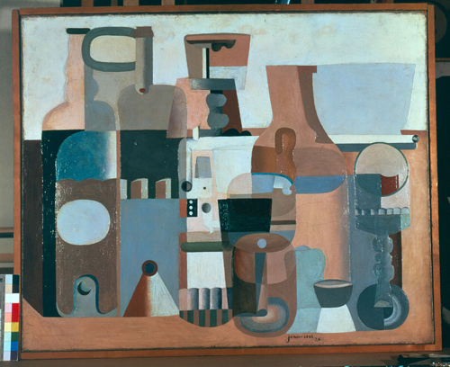
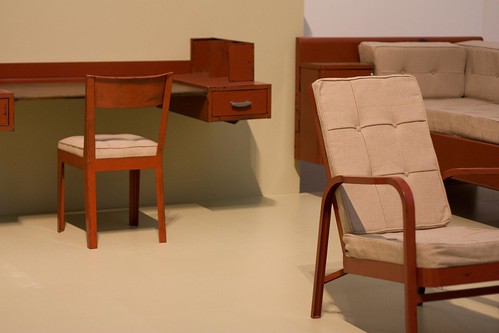
Then there’s the caption to Le Corbusier’s sole artwork in the show. This painting was part of the pavilion’s interior, as shown above – a part of it can be seen on the right edge of the photo. Like the rest of the exhibition’s contents, the caption was written in Portuguese and English. The Portuguese one, on the left, includes the sentence “Mas Le Corbusier foi longe demais para o seu tempo, suscitando críticas severas que vão mesmo ao ponto de entaipar o pavilhão que só seria inaugurado três meses após a abertura da exposição.”, which I’ll translate as “But Le Corbusier went too far for his time, provoking severe critiques that go so far as to board up the pavilion that was only opened three months after the exhibition’s opening.”. On the right, the English text read: “Le Corbusier’s work was way ahead of his time and it received harsh criticism. The situation reached the point where the pavilion was fenced in and it was only inaugurated three months after the Exhibition’s opening day.”
Okay, it took me a few paragraphs to say this is a terribly conservative show. This was an impression I got as I walked down the exhibition hall, but after I read this caption I didn’t need to go any further. By using the expression “longe demais/too far” in the Portuguese caption (the English one is much less opinionated), it’s as if the curators are saying Le Corbusier’s reaction to the “sugar cubes with honey on top” aesthetics of Ruhlmann and the like (to paraphrase design historian and d-crit faculty Russell Flinchum) was not only misunderstood at the time – it was deservedly boycotted and lambasted.
Or am I overreacting and this is just a question of translation?
Knowing both curators are of French origin, one can only guess what they originally meant. Either way, if this exhibition takes sides, it’s definitely not L’Esprit Nouveau‘s. Which is fine. It’s still a great show on what was an important landmark for applied arts and design in the 20th Century. The term design, by the way, is nowhere to be found in the exhibition.

Earlier this year, in the galleries of Lisbon’s Berardo museum that previously housed Francisco Capelo’s design collection (which now make up MUDE, Lisbon’s design and fashion museum), the exhibition Art Deco and its enemies went further. By featuring many of items from the most important décorateurs of the period that make up another millionaire’s (Joe Berardo) collection, it showed, according to its in-room handout, “Art deco at its most successful”. But it also presented “the reaction from Art deco’s detractors, like Le Corbusier, Eileen Gray, Marcel Breuer and Jean Prouvé.” The best thing in the exhibition was not even a piece of furniture, but Marcel Herbier’s delirious film L’inhumaine, sadly shown in conditions only adequate for today’s Youtube generation.
Much less sophisticated in presentation than Gulbenkian’s, this exhibition had no wall texts and virtually no extended captions. That made for cleaner walls, but also caused most people to walk, unattended and uninformed, through a gallery split in two sections: Art-Deco-like stuff and modern-like stuff (I’m aware of how loaded both terms are). No context, no explanation, nothing. I found this baffling – it was like walking through an antique store with a “vintage” section. I understand the museum may reserve its right to inform the public about the contents of its exhibition in the handout sheets made available to visitors (and the 214-page catalogue dedicated to Berardo’s Art Deco collection). But this is clearly not enough.
Applied art (and design) is not art. So (extended) captions are not optional – they’re fundamental. Even Konstantin Grcic knows this when he removes them from the gallery floor, only to extend their content on the website for his recent show, Design Real. In historical applied art/design exhibitions such as these two (no, neither of them have a website) context, explanation and a point of view matter. Otherwise we, the visitors, are left gazing at decorative, precious, priceless antiques collected by rich men.